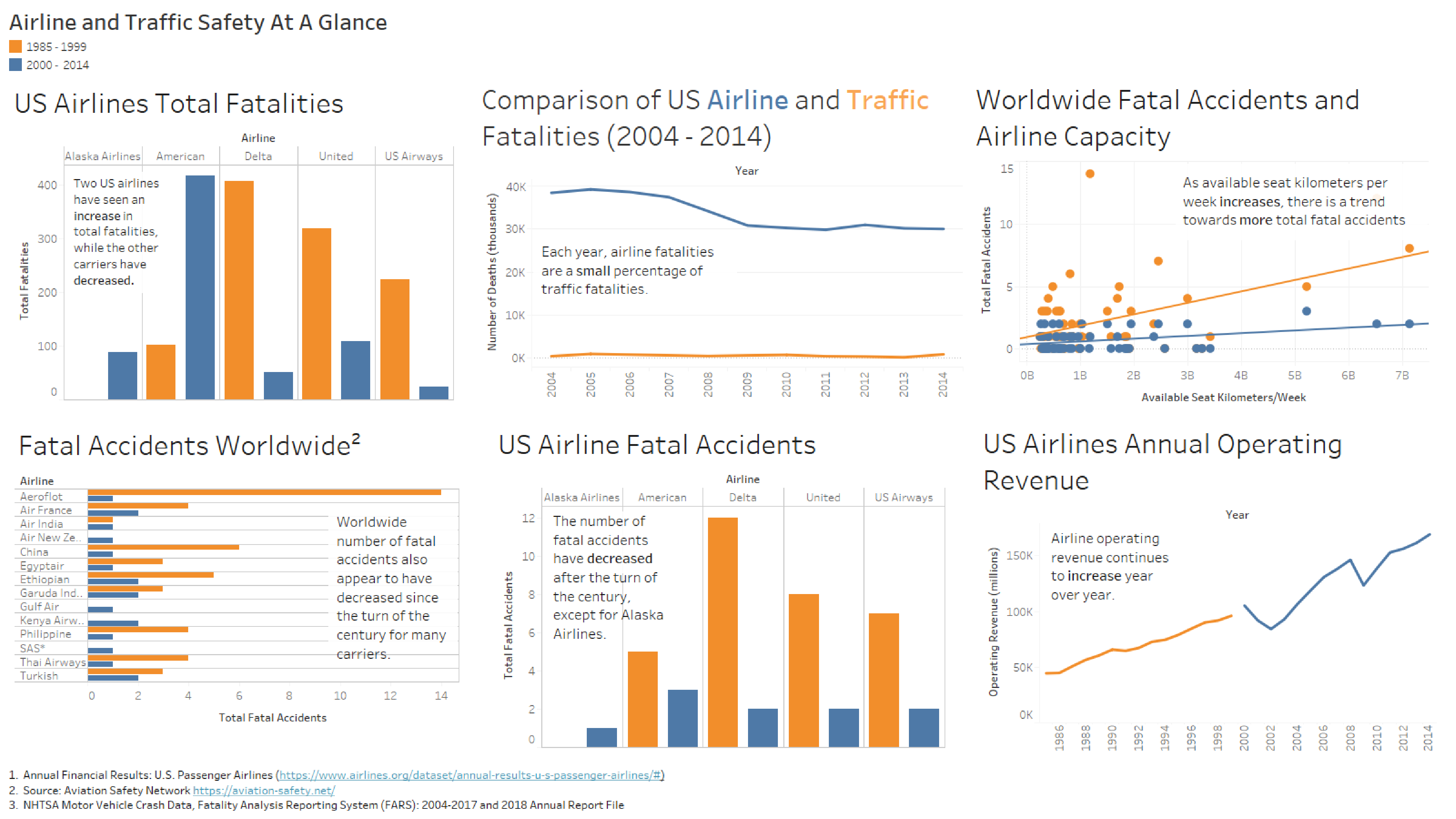
The Story About Airline Safety - Part 1 - Dashboard

This was a multi-part project broken down into different phases focused on certain types of visualizations.
The goal of this project was to use different types of data visualizations to adequately tell the story based on a hypothetical scenario. In this scenario, there has been consistent negative press after several high profile plane crashes. The public and media are beginning to question whether airlines are as safe as they have been reported to be. My job was to analyze the data and use different methods of data visualizations to describe the situation.
Part 1 of this project was to create a sample dashboard using Tableau to describe the situation and to highlight the pertinent data and conclusions from that information.
Please refer to the GitHub repository under Data Visualization and Presentation for a larger PDF version of this.

References Cited:
- AirlineGeeks.com. (2015, December 28). Airline Metrics: Available Seat Kilometers. Retrieved July 07, 2020, from https://airlinegeeks.com/2015/12/28/airline-metrics-available-seat-kilometers/
- Airlines for America. (2020). Annual Financial Results: U.S. Passenger Airlines. Retrieved July 07, 2020, from https://www.airlines.org/dataset/annual-results-u-s-passenger-airlines/
- Airline Safety Network. (2020). Airline Safety. Retrieved July 07, 2020, from https://aviationsafety. net/airlinesafety/
- NHTSA. (2020). National Highway Traffic Safety Administration. Retrieved July 07, 2020, from https://one.nhtsa.gov/Data