Lung Cancer Survival Prediction After Surgical Treatment
Problem Background:
Lung cancer is a particularly devastating type of cancer killing over 100,000 people per year in the U.S. Even with proper recognition and treatment, many times the cancer can be too advanced to successfully cure and threaet. For early stage cancers, the best predictors for survival are functional status as well as pulmonary function tests to determine lung cancer. Treatment does vary based on the tumor type as well as how far it has spread. Machine learning and data science analytics have the potential to have significant benefits in healthcare and medicine as an adjunct to clinician judgment. Can machine learning help predict survival one year after lung surgery to treat a cancer?
Dataset Description:
The dataset was obtained from the UCI Machine Learning Repository and was of 470 patients between 2007-2011 in Poland who had various risk factors and different stages of lung cancers. The variables included lung function tests, vascular risk indicators (i.e. blood pressure, smoking), performance status, and tumor stage. The target variable is survival at 1 year.
https://archive.ics.uci.edu/ml/datasets/Thoracic+Surgery+Data
Reference Cited:
Dua, D. and Graff, C. (2019). UCI Machine Learning Repository [http://archive.ics.uci.edu/ml]. Irvine, CA: University of California, School of Information and Computer Science.
Data Cleaning, Exploration, and Analysis
The initial file was in an ARFF format. This was converted outside of Python into a CSV file and then imported into Python.
| id | DGN | PRE4 | PRE5 | PRE6 | PRE7 | PRE8 | PRE9 | PRE10 | PRE11 | PRE14 | PRE17 | PRE19 | PRE25 | PRE30 | PRE32 | AGE | Risk1Yr | |
|---|---|---|---|---|---|---|---|---|---|---|---|---|---|---|---|---|---|---|
| 0 | 1 | DGN2 | 2.88 | 2.16 | PRZ1 | F | F | F | T | T | OC14 | F | F | F | T | F | 60 | F |
| 1 | 2 | DGN3 | 3.40 | 1.88 | PRZ0 | F | F | F | F | F | OC12 | F | F | F | T | F | 51 | F |
| 2 | 3 | DGN3 | 2.76 | 2.08 | PRZ1 | F | F | F | T | F | OC11 | F | F | F | T | F | 59 | F |
| 3 | 4 | DGN3 | 3.68 | 3.04 | PRZ0 | F | F | F | F | F | OC11 | F | F | F | F | F | 54 | F |
| 4 | 5 | DGN3 | 2.44 | 0.96 | PRZ2 | F | T | F | T | T | OC11 | F | F | F | T | F | 73 | T |
Description of Variables
- DGN: Diagnosis (based on ICD codes)
- PRE4: Forced Vital Capacity -FVC
- PRE5: Volume of Air Exhaled in 1 Second - FEV1
- PRE6: Performance Status (Zubrod Scale) – 3 Values (PRZ0, PRZ1, PRZ2)
- PRE7: Pain Before Surgery (T/F)
- PRE8: Hemoptysis Before Surgery (T/F)
- PRE9: Dyspnea Before Surgery (T/F)
- PRE10: Cough Before Surgery (T/F)
- PRE11: Weakness Before Surgery (T/F)
- PRE14: T in Cancer Stage – Smallest to Largest (OC11, OC12, OC13, OC14)
- PRE17: Type 2 Diabetes – (T/F)
- PRE19: MI w/in 6 Months – (T/F)
- PRE25: Peripheral Arterial Disease – (T/F)
- PRE30: Smoking – (T/F)
- PRE32: Asthma – (T/F)
- AGE: Age at Time of Surgery
- Risk1Y: Survival After 1 Year (T if Died)
The columns are not named so it was difficult to ascertain which variable is which so the columns were renamed and the datatypes changed to make sure were encoded correctly.
| FVC | FEV1 | Perf_Status | Pain | Hemoptysis | Dyspnea | Cough | Weakness | T_Stage | Diabetes | MI | PAD | Smoking | Asthma | Age | Died | |
|---|---|---|---|---|---|---|---|---|---|---|---|---|---|---|---|---|
| 0 | 2.88 | 2.16 | PRZ1 | F | F | F | T | T | OC14 | F | F | F | T | F | 60 | F |
| 1 | 3.40 | 1.88 | PRZ0 | F | F | F | F | F | OC12 | F | F | F | T | F | 51 | F |
| 2 | 2.76 | 2.08 | PRZ1 | F | F | F | T | F | OC11 | F | F | F | T | F | 59 | F |
| 3 | 3.68 | 3.04 | PRZ0 | F | F | F | F | F | OC11 | F | F | F | F | F | 54 | F |
| 4 | 2.44 | 0.96 | PRZ2 | F | T | F | T | T | OC11 | F | F | F | T | F | 73 | T |
Note that the Risk1Year category was noted to be true if the person died so the column was renamed to ‘Died’ to make sure the data was accurate.
Also, for easier use in the machine learning algorithms, the T/F nomenclature was renamed to a value of 1 if True (the person died) and 0 if False (the person survived).
#Changing Target Variable to 0 and 1 and Creating New Target Column and Dropping Old Column

df.loc[df['Died'] == 'T', 'Target'] = 1
df.loc[df['Died'] == 'F', 'Target'] = 0

df = df.drop(columns = ['Died'])
df[['Target']] = df[['Target']].astype('category')
There were no null values in the dataset. A descriptive analysis was completed on both the numerical and categorical variables.
Description of Numerical Categories
| FVC | FEV1 | Age | |
|---|---|---|---|
| count | 470.000000 | 470.000000 | 470.000000 |
| mean | 3.281638 | 4.568702 | 62.534043 |
| std | 0.871395 | 11.767857 | 8.706902 |
| min | 1.440000 | 0.960000 | 21.000000 |
| 25% | 2.600000 | 1.960000 | 57.000000 |
| 50% | 3.160000 | 2.400000 | 62.000000 |
| 75% | 3.807500 | 3.080000 | 69.000000 |
| max | 6.300000 | 86.300000 | 87.000000 |
The mean age of the participants in the study population ranged from 21 years old (very young) to 87 years old. The mean age was 62. FEV1 mean value was 4.56 and FVC mean value was 3.28. Looking at the max value for FEV1 of 86, that is extraordinarily high and may be an error. When visualizing our box plots, will look for this datapoint to see if this is a mistake.
Description of Categorical Variables
| Perf_Status | Pain | Hemoptysis | Dyspnea | Cough | Weakness | T_Stage | Diabetes | MI | PAD | Smoking | Asthma | Target | |
|---|---|---|---|---|---|---|---|---|---|---|---|---|---|
| count | 470 | 470 | 470 | 470 | 470 | 470 | 470 | 470 | 470 | 470 | 470 | 470 | 470.0 |
| unique | 3 | 2 | 2 | 2 | 2 | 2 | 4 | 2 | 2 | 2 | 2 | 2 | 2.0 |
| top | PRZ1 | F | F | F | T | F | OC12 | F | F | F | T | F | 0.0 |
| freq | 313 | 439 | 402 | 439 | 323 | 392 | 257 | 435 | 468 | 462 | 386 | 468 | 400.0 |
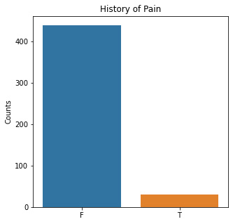
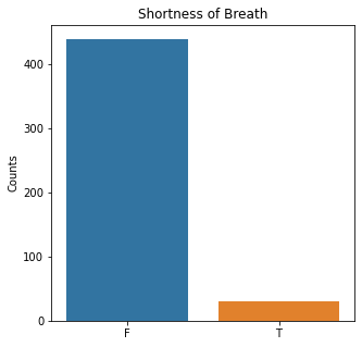
Died is the target variable and it appears that a large number of participants survived in this population, 400 out of 470 total. The majority of the participants did not have pain, hemoptysis, dyspnea, or weakness. Further, the majority did not have diabetes, a heart attack, peripheral arterial disease, or asthma. The majority of the participants did have cough. The most common performance status was Zubrod Scale 1 with 0 being asymptomatic to 2 being more symptomatic.
The majority of the participants were smokers which is logical in that those who smoke are likely to get lung cancer. Further, when looking at the T_stage of the cancer, the most common value was a T of 2.
The distribution of these is interesting in that these appear to be relatively low risk lung cancer patients in that they do not have a lot of other co-morbidities, a poor functional status, etc. This could explain why so many participants survived.
The numerical variables were then analyzed for any high levels of correlation >0.95.
#Searching for High Correlations

corr_matrix = df.corr()
corr_matrix
| FVC | FEV1 | Age | |
|---|---|---|---|
| FVC | 1.000000 | 0.032975 | -0.290178 |
| FEV1 | 0.032975 | 1.000000 | -0.115900 |
| Age | -0.290178 | -0.115900 | 1.000000 |
#Displaying Heat Map
plt.rcParams['figure.figsize'] = (5,5)

#Importing Packages
import seaborn as sns

sns.heatmap(corr_matrix)
plt.show()
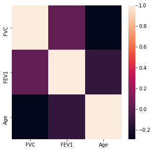
There do not appear to be any highly correlated values with an absolute correlation value of >0.95.
The numerical variable distributions were visualized with histograms.
#Visualizing Numerical Data
df_num = df.drop(columns=['Perf_Status', 'Pain', 'Hemoptysis', 'Dyspnea', 'Cough', 'Weakness', 'T_Stage', 'Diabetes', 'MI', 'PAD', 'Smoking', 'Asthma', 'Target'])


#Setting Figure Size
plt.figure(figsize=[30,30])

f,a = plt.subplots(1,3, figsize=(30,10))

a = a.ravel()
for idx, ax in enumerate(a):
    ax.hist(df_num.iloc[:,idx], bins = 150)
    ax.set_title(df_num.columns[idx], size = 40)
    ax.set_ylabel('Counts', size = 20)
plt.show()
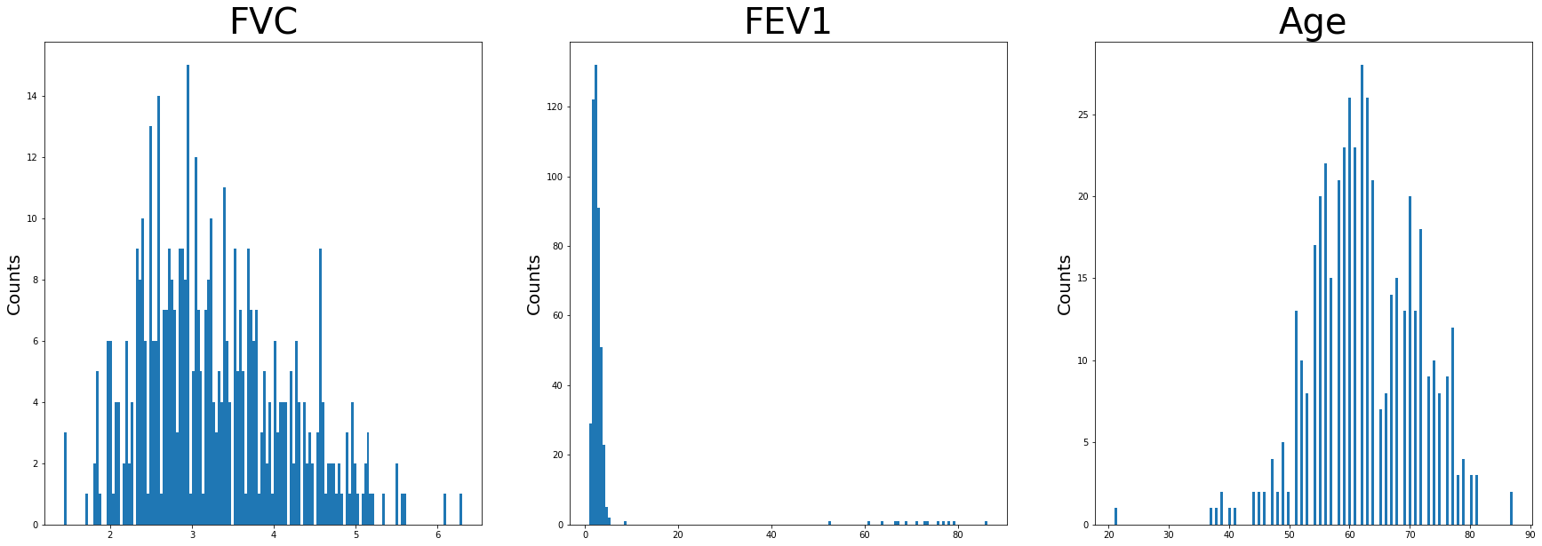
Age appears to be approximately normally distributed. FEV1 has negative skew as well as FVC. There are high values of FEV1 as well noted on this. These are unusually high and not typical. For the sake of this project, the outliers were included.
Using bar plots, the categorical variables were then visualized.
#Visualizing Categorical Data
['Perf_Status', 'Pain', 'Hemoptysis', 'Dyspnea', 'Cough', 'Weakness', 'T_Stage', 'Diabetes', 'MI', 'PAD', 'Smoking', 'Asthma', 'Died']
sns.countplot(x = 'Target', data = df)
plt.title('Death After 1 Year')
plt.xlabel(xlabel = None)
plt.xticks([0,1], ['Alive', 'Dead'])
plt.ylabel('Counts')
plt.show()
sns.countplot(x = 'Perf_Status', data = df)
plt.title('Performance Status')
plt.xlabel(xlabel = None)
plt.ylabel('Counts')
plt.show()
sns.countplot(x = 'Pain', data = df)
plt.title('History of Pain')
plt.xlabel(xlabel = None)
plt.ylabel('Counts')
plt.show()
sns.countplot(x = 'Dyspnea', data = df)
plt.title('Shortness of Breath')
plt.xlabel(xlabel = None)
plt.ylabel('Counts')
plt.show()
sns.countplot(x = 'Cough', data = df)
plt.title('History of Cough')
plt.xlabel(xlabel = None)
plt.ylabel('Counts')
plt.show()
sns.countplot(x = 'Weakness', data = df)
plt.title('History of Weakness')
plt.xlabel(xlabel = None)
plt.ylabel('Counts')
plt.show()
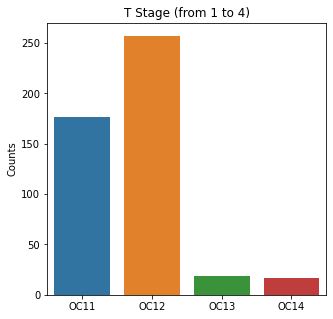
sns.countplot(x = 'T_Stage', data = df)
plt.title('T Stage (from 1 to 4)')
plt.xlabel(xlabel = None)
plt.ylabel('Counts')
plt.show()
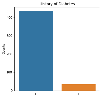
sns.countplot(x = 'Diabetes', data = df)
plt.title('History of Diabetes')
plt.xlabel(xlabel = None)
plt.ylabel('Counts')
plt.show()
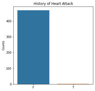
sns.countplot(x = 'MI', data = df)
plt.title('History of Heart Attack')
plt.xlabel(xlabel = None)
plt.ylabel('Counts')
plt.show()
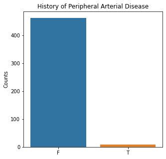
sns.countplot(x = 'PAD', data = df)
plt.title('History of Peripheral Arterial Disease')
plt.xlabel(xlabel = None)
plt.ylabel('Counts')
plt.show()
sns.countplot(x = 'Smoking', data = df)
plt.title('History of Smoking')
plt.xlabel(xlabel = None)
plt.ylabel('Counts')
plt.show()
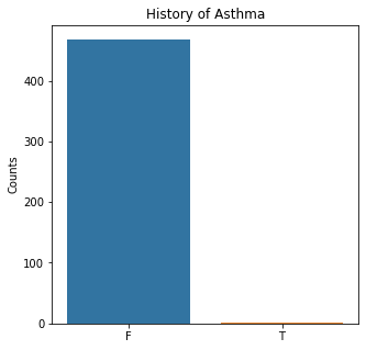
sns.countplot(x = 'Asthma', data = df)
plt.title('History of Asthma')
plt.xlabel(xlabel = None)
plt.ylabel('Counts')
plt.show()
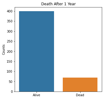
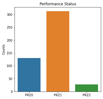
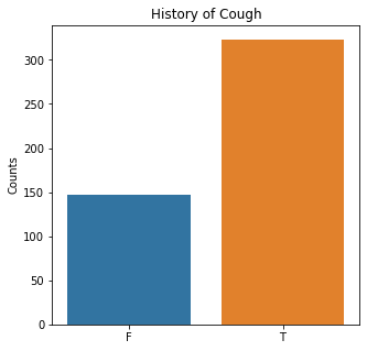
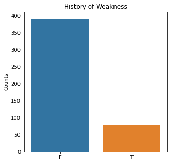
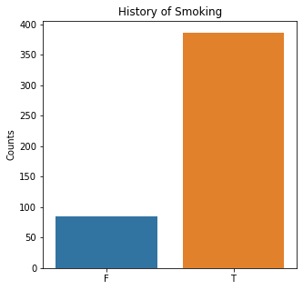
The graphs here confirm what was seen in the descriptive analysis. The majority of participants survived. Most participants did have cough and history of smoking. The most common functional status was Zubrod 1 which is between being completely asymptomatic and having about 50% of the day impacted by symptoms.
Very few patients in this study had a history of asthma, diabetes, peripheral arterial disease, or heart attack.
Further, when looking at the distribution for the T staging, most people had T1 or 2 tumors. This is a small and earlier stage tumor. Few patients had T3 or T4. These are more advanced tumors and would have a worse prognosis.
Given these demographics, it bears mentioning that the study population in this dataset have relatively healthy cancer patients without significant co-morbidities. With significant co-morbidities, survival would be expected to be worse for treatment for cancer.
Boxplots were then utilized to look for outliers in the numerical variables.
#Visualizing Boxplots to Assess for Outliers

plt.boxplot(df['Age'])
plt.title('Boxplot of Age')
plt.ylabel('Age (years)')
plt.show()

plt.boxplot(df['FEV1'])
plt.title('Boxplot of FEV1')
plt.ylabel('FEV1 (Liters)')
plt.show()

plt.boxplot(df['FVC'])
plt.title('Boxplot of FVC')
plt.ylabel('FVC (Liters)')
plt.show()
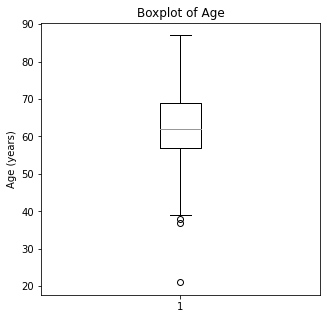
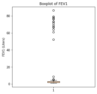
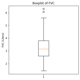
When looking at the numerical variables, there are outliers in the FEV1 values and a couple of outliers in the FVC in liters. The age variable has less though there were some younger patients that would be unexpected in a population of people who had lung cancer as this is generally a disease of an older population.
Using swarm plots, the numerical variables were compared with the target class of survival or death to look for any interesting patterns.
#Visualizing Swarm Plots to Compare Target Variable to Our Numeric Explanatory Variables

categories = df.Target

sns.swarmplot(categories, df.Age)
plt.title('Age vs. Death After 1 Year')
plt.xlabel(xlabel = None)
plt.xticks([0,1], ['Alive', 'Dead'])
plt.ylabel('Age (years)')
plt.show()

sns.swarmplot(categories, df.FVC)
plt.title('FVC vs. Death After 1 Year')
plt.xlabel(xlabel = None)
plt.xticks([0,1], ['Alive', 'Dead'])
plt.ylabel('FVC (liters)')
plt.show()

sns.swarmplot(categories, df.FEV1)
plt.title('FEV1 vs. Death After 1 Year')
plt.xlabel(xlabel = None)
plt.xticks([0,1], ['Alive', 'Dead'])
plt.ylabel('FEV1 (liters)')
plt.show()
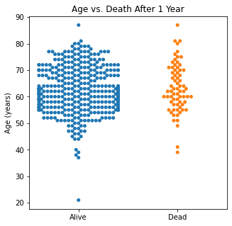
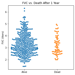
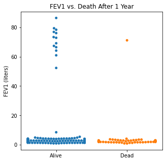
There does not appear to be too much of a difference between age distributions, FEV1, and FVC compared to survival.
Machine Learning Algorithms
Initially, I ran the machine learning algorithms with the outliers (which are likely errors) included and then will compare by doing the same algorithms without the outliers to see if this makes a difference.
Coding examples and imaging will not be included if removing the outliers worsens the predictive model.
K Means Clustering
First, an unsupervised machine learning technique was run with the target class removed to see how accurately the two classes could be predicted both with the outliers included and without the outliers included.
from sklearn.cluster import KMeans
from sklearn.preprocessing import StandardScaler

features = df.loc[:, df.columns != 'Target']
features = pd.get_dummies(features)
standardizer = StandardScaler()
features_standardized = standardizer.fit_transform(features)

x = np.array(features_standardized)
y = np.array(df['Target'])

kmeans = KMeans(n_clusters = 2)
kmeans.fit(x)
KMeans(n_clusters=2)
correct = 0
for i in range(len(x)):
    predict_me = np.array(x[i].astype(float))
    predict_me = predict_me.reshape(-1, len(predict_me))
    prediction = kmeans.predict(predict_me)
    if prediction[0] == y[i]:
        correct += 1

print('K Means Clustering Algorithm Accuracy:', correct/len(x))
K Means Clustering Algorithm Accuracy: 0.6042553191489362
Using K Means learning, dropping the target column and then comparing the clustering algorithm with the true results, there was an accuracy of 60.4%. When using the dataset with the outliers removed from the dataset, the accuracy dropped to 38%
Logistic Regression
Logistic regression was then used to predict the target class with the outliers included and then with the outliers removed.
#Importing Packages
from sklearn.model_selection import train_test_split
from sklearn.linear_model import LogisticRegression
from sklearn.preprocessing import StandardScaler
from sklearn.metrics import classification

from yellowbrick.classifier import ConfusionMatrix, ClassificationReport, ROCAUC

#Creating Features and Target Objects
features = df.loc[:, df.columns != 'Target']
target = df['Target']

#Getting Dummies for Our Categoricals
features = pd.get_dummies(features)

#Creating Standardizer and Logit Objects
standardizer = StandardScaler()
logit = LogisticRegression(class_weight = 'balanced')

#Standardizing Features
features_standardized = standardizer.fit_transform(features)

#Train/Test Split
features_train, features_test, target_train, target_test = train_test_split(features_standardized, target, test_size = 0.2)

#Fitting Data to Logistic Regression Classifier
logreg = logit.fit(features_train, target_train)

#Confusion Matrix Visualizer
classes = ['Survived', 'Died']
cm = ConfusionMatrix(logit, classes = classes, percent = False)

#Fitting Passed Model
cm.fit(features_train, target_train)
cm.score(features_test, target_test)

#Changing Fontsize in Figure
for label in cm.ax.texts:
    label.set_size(20)

cm.poof()

#Configuring Graph Parameters
plt.rcParams['figure.figsize'] = (15,7)
plt.rcParams['font.size'] = 20

visualizer = ClassificationReport(logit, classes = classes)
visualizer.fit(features_train, target_train)
visualizer.score(features_test, target_test)
g = visualizer.poof()

#ROC/AUC Curve

roc = ROCAUC(logit)
roc.fit(features_train, target_train)
roc.score(features_test, target_test)
g = roc.poof()
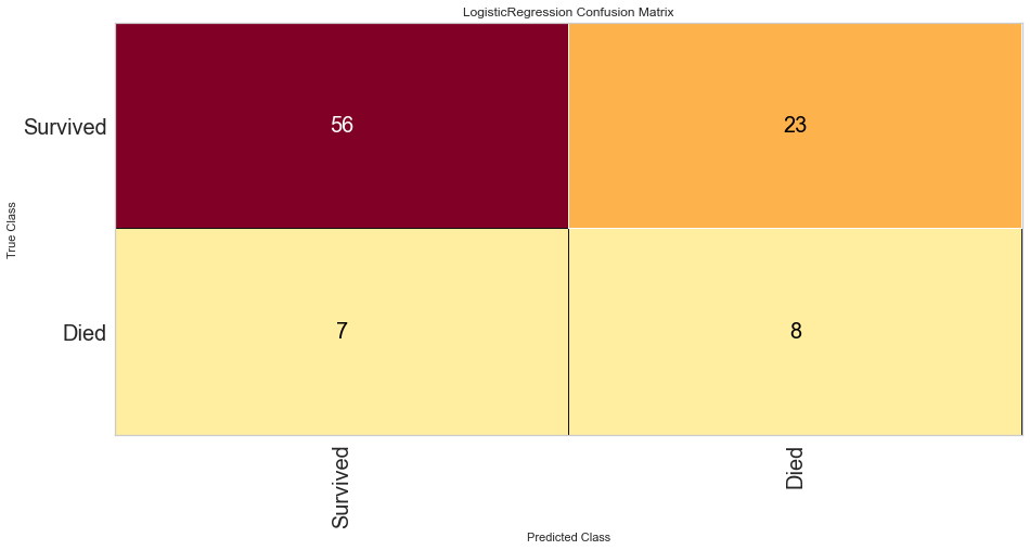
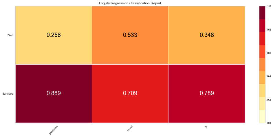
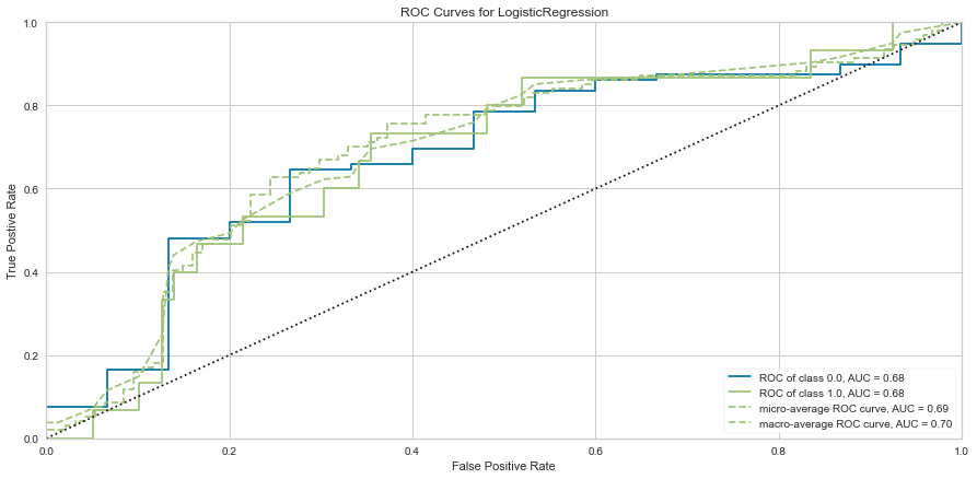
Logistic regression had a high F1 score of 0.789 for predicting survival. It had a comparatively low score of 0.348 when predicting death. ROC was 0.68 for both classes. There were 7 false negatives predicted in that the model predicted survival when the person actually died.
Removing the outliers reduced the F1 metrics as well as the ROC for both predicted classes.
Variable feature importance was then analyzed.
#Checking Variable Feature Importance

from yellowbrick.model_selection import FeatureImportances

#Getting Labels and Checking Feature Importance for Log Reg Model
labels = list(map(lambda x: x.title(), features))
viz = FeatureImportances(logreg, labels = labels)
viz.fit(features_train, features_test)
viz.show()
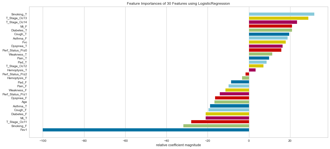
Ranking the feature importance was very interesting in that it relatively weighted smokers, T3/4 tumors (higher stage), gender, diabetes, cough, and shortness of breath relatively highly. Interestingly enough, the FEV1 status was considered the least important by relative coefficients.
Support Vector Machine Classifier
A SVM classifier was then run and feature importances analyzed.
#Importing Packages
from sklearn.svm import SVC

#Resetting our Target Object to Not Have Dummy Variables
target = df['Target']

#Creating SVM Object
svc = SVC(kernel='linear', class_weight = 'balanced')

#Train/Test 80/20 Split
features_train, features_test, target_train, target_test = train_test_split(features_standardized, target, test_size = 0.2, random_state = 1)

svc.fit(features_train, target_train)

cm_svc = ConfusionMatrix(svc, classes = classes, percent = False)
cm_svc.fit(features_train, target_train)
cm_svc.score(features_test, target_test)
cm_svc.poof()

svc_vis = ClassificationReport(svc, classes = classes)
svc_vis.fit(features_train, target_train)
svc_vis.score(features_test, target_test)
svc_vis.poof()

svc_roc = ROCAUC(svc, micro = False, macro = False, per_class = False)
svc_roc.fit(features_train, target_train)
svc_roc.score(features_test, target_test)
svc_roc.poof()
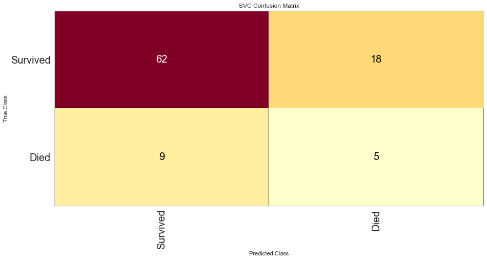
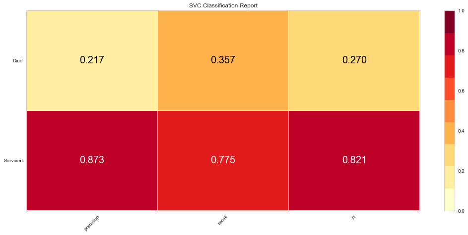
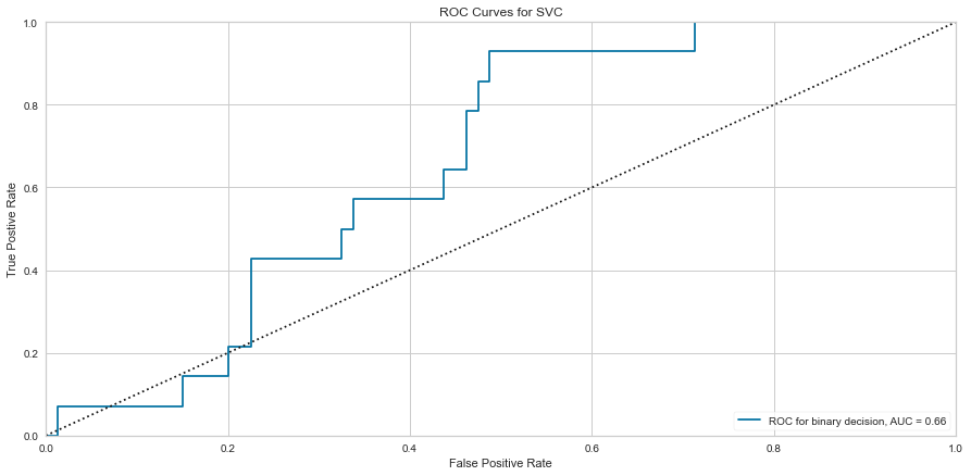
The SVC model performed similarly to the logistic regression model. However, there were 9 false negatives, which was higher than the logistic regression model. The F1 score for predicting survival was higher at 0.821 but the prediction of death was lower at 0.270. The ROC was also lower at 0.66.
Removing the outliers also resulted in lower F1 metrics and ROC for both classes.
#Checking Feature Importance
labels = list(map(lambda x: x.title(), features))
viz = FeatureImportances(svc, labels = labels)
viz.fit(features_train, features_test)
viz.show()
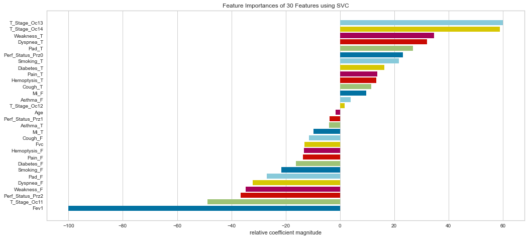
The SVC model agreed with the logistic regression model in that the T3/4 higher stage tumors were relatively more important. It also noted shortness of breath, weakness, and smoking as highly important. The FEV1 was considered the least important measure.
KNN
#Importing Packages
from sklearn.neighbors import KNeighborsClassifier
from sklearn.model_selection import GridSearchCV, RandomizedSearchCV
from sklearn.metrics import classification_report, confusion_matrix

#Getting Dummies for Target Variable
features = pd.get_dummies(features)
target = pd.get_dummies(df['Target'])

#Standardizing Features

standardizer = StandardScaler()
features_standardized = standardizer.fit_transform(features)

#Train/Test 80/20 Split
features_train, features_test, target_train, target_test = train_test_split(features_standardized, target, test_size = 0.2, random_state = 1)

#Starting with KNN of 3
knn = KNeighborsClassifier(n_neighbors = 3, n_jobs = -1)
knn.fit(features_train, target_train)

#Visualizing Metrics
target_pred = knn.predict(features_test)
test = np.array(target_test).argmax(axis=1)
predictions = np.array(target_pred).argmax(axis=1)
print('Confusion Matrix:\n', confusion_matrix(test, predictions), '\n')
print('Classification Report:\n', classification_report(test, predictions), '\n')
Confusion Matrix:
 [[76  4]
 [13  1]]

Classification Report:
               precision    recall  f1-score   support

           0       0.85      0.95      0.90        80
           1       0.20      0.07      0.11        14

    accuracy                           0.82        94
   macro avg       0.53      0.51      0.50        94
weighted avg       0.76      0.82      0.78        94
#Hyperparameter Tuning for KNN Using GridSearch CV

param_dist = {"leaf_size": list(range(1,50)),
             "n_neighbors": list(range(1,30)),
             "p": [1,2]}

#Using GridSearch Object
clf = GridSearchCV(knn, param_dist, cv=10, n_jobs = -1)
best_model = clf.fit(features_standardized, target)

print('Best Leaf Size:', best_model.best_estimator_.get_params()['leaf_size'])
print('Best p:', best_model.best_estimator_.get_params()['p'])
print('Best n_neighbors:', best_model.best_estimator_.get_params()['n_neighbors'])
print('Best Metric:', best_model.best_estimator_.get_params()['metric'])
print('Best Weights:', best_model.best_estimator_.get_params()['weights'])
Best Leaf Size: 1
Best p: 1
Best n_neighbors: 11
Best Metric: minkowski
Best Weights: uniform
#Running New Tuned Model and Evaluating Metrics
knn_best = KNeighborsClassifier(n_neighbors = 11, p = 1, leaf_size = 1, metric = "minkowski", weights= "uniform", n_jobs = -1)
knn_best.fit(features_train, target_train)
target_pred = knn_best.predict(features_test)
test = np.array(target_test).argmax(axis=1)
predictions = np.array(target_pred).argmax(axis=1)
print("Confusion Matrix:\n", confusion_matrix(test, predictions),'\n')
print("Classification Report:\n", classification_report(test, predictions))
Confusion Matrix:
 [[75  0]
 [17  0]]

Classification Report:
               precision    recall  f1-score   support

           0       0.82      1.00      0.90        75
           1       0.00      0.00      0.00        17

    accuracy                           0.82        92
   macro avg       0.41      0.50      0.45        92
weighted avg       0.66      0.82      0.73        92
The KNN model had a high F1 score at predicting survival at 0.90. However, even with the tuned hyperparameters, it had a 0 score for F1 for predicting death. This would be the worst performing model since the point of the model would be to predict risk of death, not risk of survival. Removing the outliers resulted in worsening scores.
XG Boost
Finally, an XG Boost ensemble model was run in the same manner as the other techniques above.
#Importing Packages
from xgboost import XGBClassifier

features = pd.get_dummies(features)
target = df['Target']

#Train/Test 80/20 Split
features_train, features_test, target_train, target_test = train_test_split(features, target, test_size = 0.2, random_state = 1)

xgb = XGBClassifier(random_state = 1)
xgb.fit(features_train, target_train)

#Visualizing Confusion Matrix, Class Report, and ROC Curve
xgb_cm = ConfusionMatrix(xgb, classes = classes, percent = False)
xgb_cm.fit(features_train, target_train)
xgb_cm.score(features_test, target_test)
xgb_cm.poof()

xgb_class = ClassificationReport(xgb, classes = classes)
xgb_class.fit(features_train, target_train)
xgb_class.score(features_test, target_test)
xgb_class.poof()

xgb_roc = ROCAUC(xgb)
xgb_roc.fit(features_train, target_train)
xgb_roc.score(features_test, target_test)
xgb_roc.poof()
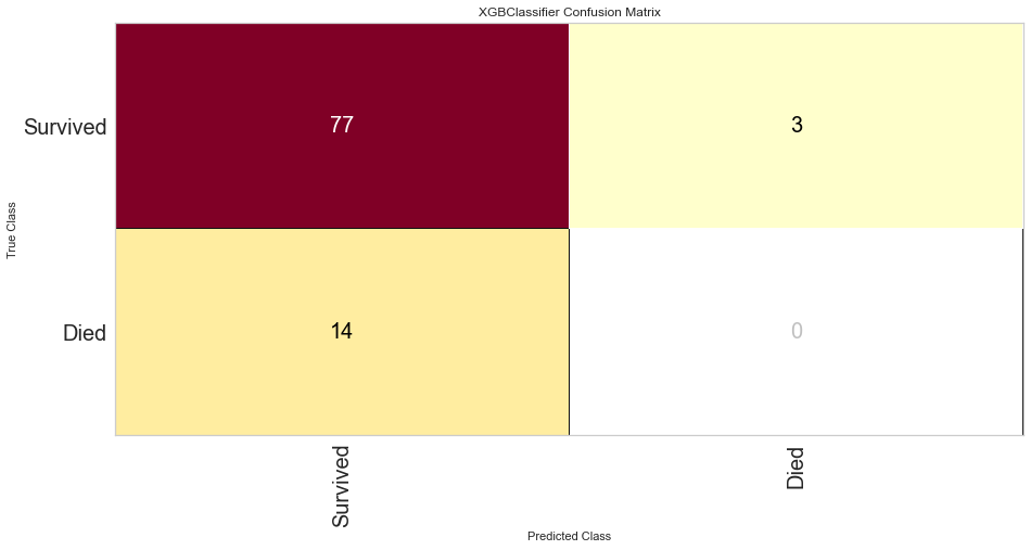
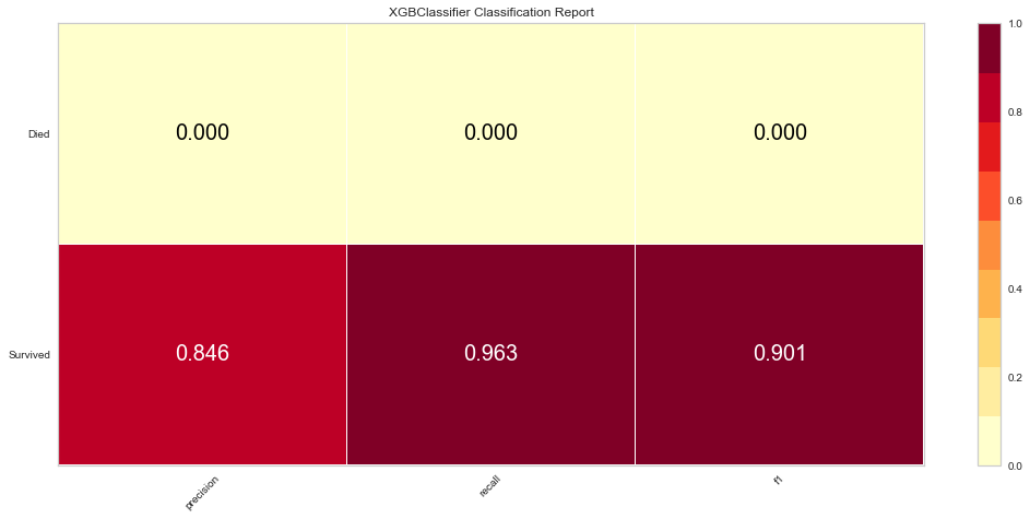
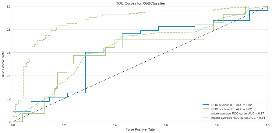
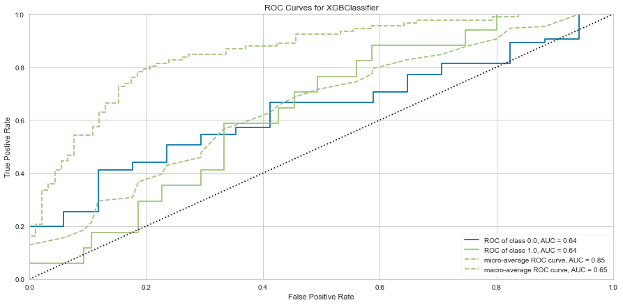
The XG Boost model had a high F1 score at 0.90 for predicting survival with a 0 score for F1. ROC was 0.62. This performed similarly to the KNN model.
#Checking Feature Importance
labels = list(map(lambda x: x.title(), features))
viz = FeatureImportances(xgb, labels = labels)
viz.fit(features_train, features_test)
viz.show()
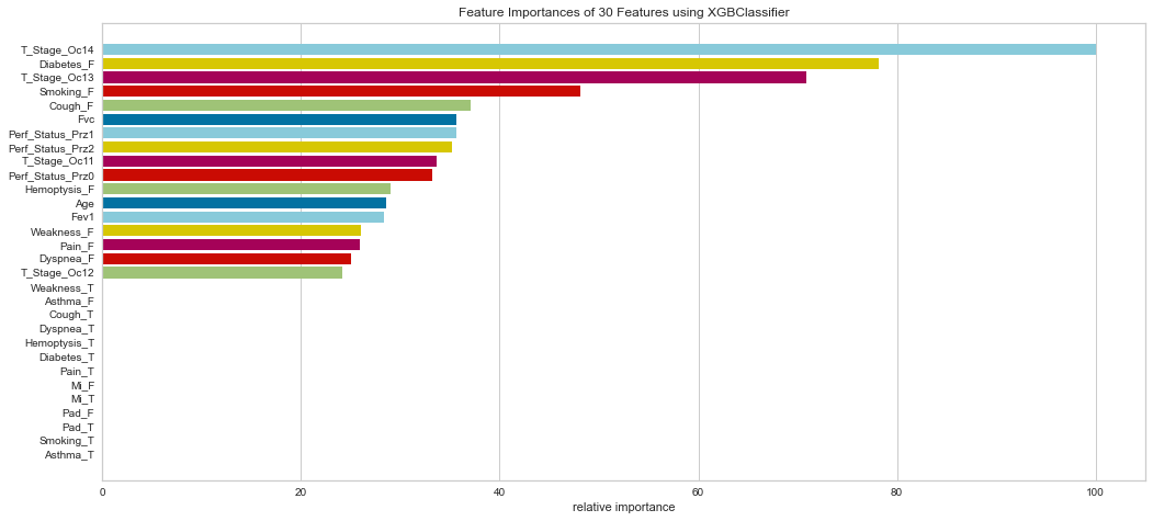
Similarly, the XG Boost model weighted T Stage 3/4, absence of diabetes, absence of smoking, and absence of cough highly.
After removing the outliers, the XG Boost model had surprising results.
features = pd.get_dummies(features)
target = df1['Target']

#Train/Test 80/20 Split
features_train, features_test, target_train, target_test = train_test_split(features, target, test_size = 0.2, random_state = 1)

xgb = XGBClassifier(random_state = 1)
xgb.fit(features_train, target_train)

#Visualizing Confusion Matrix, Class Report, and ROC Curve
xgb_cm = ConfusionMatrix(xgb, classes = classes, percent = False)
xgb_cm.fit(features_train, target_train)
xgb_cm.score(features_test, target_test)
xgb_cm.poof()

xgb_class = ClassificationReport(xgb, classes = classes)
xgb_class.fit(features_train, target_train)
xgb_class.score(features_test, target_test)
xgb_class.poof()

xgb_roc = ROCAUC(xgb)
xgb_roc.fit(features_train, target_train)
xgb_roc.score(features_test, target_test)
xgb_roc.poof()
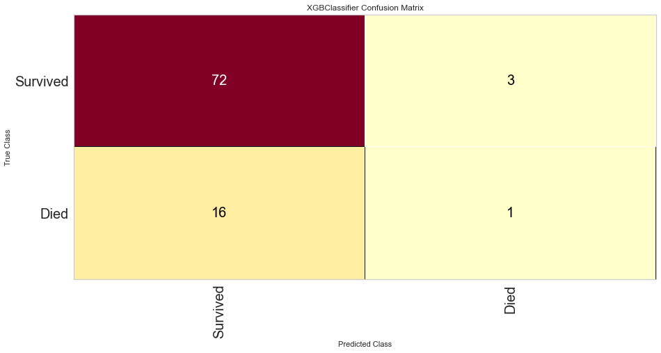
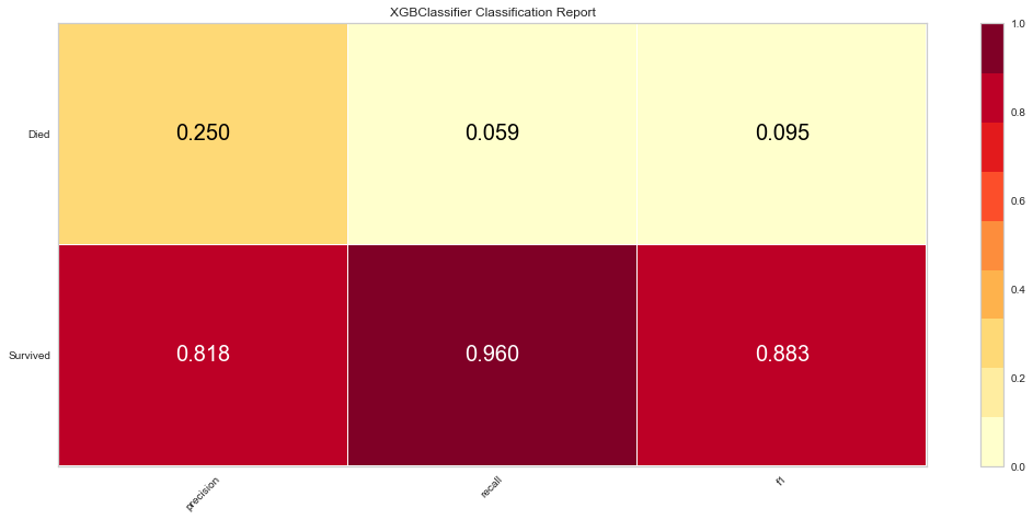
Once the outliers were removed had a slightly decreased prediction of survival F1 score but did have a slightly better prediction score for predicting death. The ROC was slightly higher for both classes as well. The feature importances also changed slightly in that in this model, the worse performance status was relatively more important. T3/4 tumor stage continued to be highly important as well.
Conclusions
This dataset was challenging in a multitude of ways. The file format was unusual and the variables and columns had to be renamed. Further, for machine learning modelling, the target variable was switched to a numerical boolean for easier processing.
The main issue with this dataset is that this dataset had a significantly higher survived population than the died population. With an imbalanced target class, the algorithms will usually predict the higher proportion class since it is more likely to be correct. With class balancing, this did improve somewhat but all F1 scores for predicting death were lower than 0.3.
The purpose of this data is to develop an algorithm that would predict those at high risk of complications or death. That way, there could be further interventions or intensification of care and monitoring to help prevent that outcome. None of the machine learning models here performed very well with predicting what we want to predict. Overall, the logistic regression did the best at prediction with the highest F1 scores for both predicted survival and death though it was poorly accurate at predicting death. The point of the project is to identify high risk patients so that clinical care could be changed to help improve outcomes more favorably.
It is very interesting that many of the methods seemed to pick out the same variables that are medically well-known to correlate with survival, notably the performance status and T stage of the tumor. This suggests that machine learning can pick up on logical data trends that are logically known, but the algorithm picked this out statistically without outside knowledge of the background of the problem.
We would require a much larger dataset and a much more varied patient population in order to have highly predictive algorithms.
To see more complete coding and analysis, please refer to my GitHub repository.