Data Exploration and Analysis of Heart Disease Dataset And Prediction with Logistic Regression

Background:
Coronary artery disease is one of the most common causes of death for both men and women. As people age, the incidence of coronary artery disease increases. Thus, it is important to be able to predict the incidence of heart disease.
This dataset is from the UCI Machine Learning Repository describing baseline demographic characteristics and heart-related testing data. The goal was to predict with the variables supplied whether or not heart disease was identified clinically.
Dataset URL:
UCI Machine Learning Repository - Heart Disease:
https://archive.ics.uci.edu/ml/datasets/heart+disease
Dataset Contributors:
- Hungarian Institute of Cardiology. Budapest: Andras Janosi, M.D.
- University Hospital, Zurich, Switzerland: William Steinbrunn, M.D.
- University Hospital, Basel, Switzerland: Matthias Pfisterer, M.D.
- V.A. Medical Center, Long Beach and Cleveland Clinic Foundation: Robert Detrano, M.D., Ph.D.
Source Cited:
Dua, D. and Graff, C. (2019). UCI Machine Learning Repository [http://archive.ics.uci.edu/ml]. Irvine, CA: University of California, School of Information and Computer Science.
Data Importing and Cleaning
Note this dataset is completed using the dependencies from ThinkStats2.
The CSV file was imported into a Pandas DataFrame in Jupyter notebook.
| age | sex | cp | trestbps | chol | fbs | restecg | thalach | exang | oldpeak | slope | ca | thal | target | |
|---|---|---|---|---|---|---|---|---|---|---|---|---|---|---|
| 0 | 63 | 1 | 3 | 145 | 233 | 1 | 0 | 150 | 0 | 2.3 | 0 | 0 | 1 | 1 |
| 1 | 37 | 1 | 2 | 130 | 250 | 0 | 1 | 187 | 0 | 3.5 | 0 | 0 | 2 | 1 |
| 2 | 41 | 0 | 1 | 130 | 204 | 0 | 0 | 172 | 0 | 1.4 | 2 | 0 | 2 | 1 |
| 3 | 56 | 1 | 1 | 120 | 236 | 0 | 1 | 178 | 0 | 0.8 | 2 | 0 | 2 | 1 |
| 4 | 57 | 0 | 0 | 120 | 354 | 0 | 1 | 163 | 1 | 0.6 | 2 | 0 | 2 | 1 |
There are 303 different data points as well as 14 separate variables, which includes the target variable.
Description of Dataset and Variables:
Age: Float
Sex: Categorical (0 = Female, 1 = Male)
CP: (Chest Pain Type): Categorical (0=Typical Angina, 1 = Atypical Angina, 2 = Non-Anginal Pain, 3 = Asymptomatic)
trestbps: (Resting Systolic Blood Pressure - mmHG): Float
chol (Cholesterol): Float
fbs (Fasting Blood Sugar): Categorical (0=<120 and 1=>120)
restecg (Resting EKG Findings): Categorical (0=Normal, 1 = ST/T-wave Abnormalities, 2 = Showing Probable or Definite LVH
thalach (Max HR Achieved On Stress Test): Float
exang (Exercise Induced Angina): Categorical (1=Yes, 0= No)
oldpeak (ST depression induced by exercise): Float
slope (Slope of ST Segment During Stress Testing): Categorical (0=Upsloping, 1 = Flat, 2 = Downsloping)
ca (Number of Major Vessels Imaged During Angiogram): Float
thal (Measure of Heart Tissue Defects): Categorical (3 = Normal, 6 = Fixed Defect, 7 = Reversible Defect
Target: Categorical (CAD Presence/Absence) 0 is Absent, 1 is Present - Target Variable
#Searching for Null Values
df.isnull().values.any()
False
There were no null values in this dataset.
The respective categories were recoded into their proper categorical sub-types and descriptive analysis was performed on the numerical and categorical variables.
#Descriptive Statistics of Numerical Features of Dataframe
df.describe()
| age | trestbps | chol | thalach | oldpeak | ca | |
|---|---|---|---|---|---|---|
| count | 303.000000 | 303.000000 | 303.000000 | 303.000000 | 303.000000 | 303.000000 |
| mean | 54.366337 | 131.623762 | 246.264026 | 149.646865 | 1.039604 | 0.729373 |
| std | 9.082101 | 17.538143 | 51.830751 | 22.905161 | 1.161075 | 1.022606 |
| min | 29.000000 | 94.000000 | 126.000000 | 71.000000 | 0.000000 | 0.000000 |
| 25% | 47.500000 | 120.000000 | 211.000000 | 133.500000 | 0.000000 | 0.000000 |
| 50% | 55.000000 | 130.000000 | 240.000000 | 153.000000 | 0.800000 | 0.000000 |
| 75% | 61.000000 | 140.000000 | 274.500000 | 166.000000 | 1.600000 | 1.000000 |
| max | 77.000000 | 200.000000 | 564.000000 | 202.000000 | 6.200000 | 4.000000 |
Descriptive Analysis Summary of Numerical Variables
The oldest person in the dataset was 77 and the youngest was 29 years of age with mean age of 54.
The max systolic resting blood pressure on arrival to the hospital was 200 and the lowest was 94. Average systolic BP was 131 which is considered within normal limits.
Max cholesterol reading was 564, an extremely high value, and the lowest was 71, which is low. The mean cholesterol was 246 and many authorities recommend total cholesterol to be 200 or less.
The oldpeak variable is a measure by how much the ST segment became depressed during a stress test. This is indicative of ischemia or vulnerable heart tissue and the higher the number the worse it is. In this case, there was 4 mm ST depression (exceedingly high and worrisome) and the lowest was 0. The mean value was 1 indicating many people did have some ST depression.
The ca variable describes how many coronary blood vessels were imaged during an angiogram (the gold standard of determining heart disease). The max was 4 and the minimum was 0 meaning they were not imaged at all.
#Checking Descriptive Statistics of Categorical variables
df.describe(include=['category'])
| sex | cp | fbs | restecg | exang | slope | thal | target | |
|---|---|---|---|---|---|---|---|---|
| count | 303 | 303 | 303 | 303 | 303 | 303 | 303 | 303 |
| unique | 2 | 4 | 2 | 3 | 2 | 3 | 4 | 2 |
| top | 1 | 0 | 0 | 1 | 0 | 2 | 2 | 1 |
| freq | 207 | 143 | 258 | 152 | 204 | 142 | 166 | 165 |
Descriptive Analysis of Categorical Variables
The most common values were males, fasting blood sugars <120, with their EKG showing ST/T abnormalities. Most of the participants did not have exercise induced angina or chest pain on stress testing. Further, the most common value for the target variable was confirmed heart disease.
Visualization of Both Numeric and Categorical Variable Distributions
#Visualizing Distributions of Numerical Variables

#Creating Dataframe of Only Numerical Variables
df1 = df.drop(['sex', 'cp', 'fbs', 'restecg', 'exang', 'slope', 'thal', 'target', 'ca'], axis = 1)

#Setting Figure Size
plt.figure(figsize=[100,100])

f,a = plt.subplots(2,3, figsize = (60, 30))

#Iterating Through Our Variables
a = a.ravel()
for idx, ax in enumerate(a):
    ax.hist(df1.iloc[:,idx], bins=150)
    ax.set_title(df1.columns[idx], size = 40)
    ax.set_ylabel('Counts', size = 20)
plt.show()
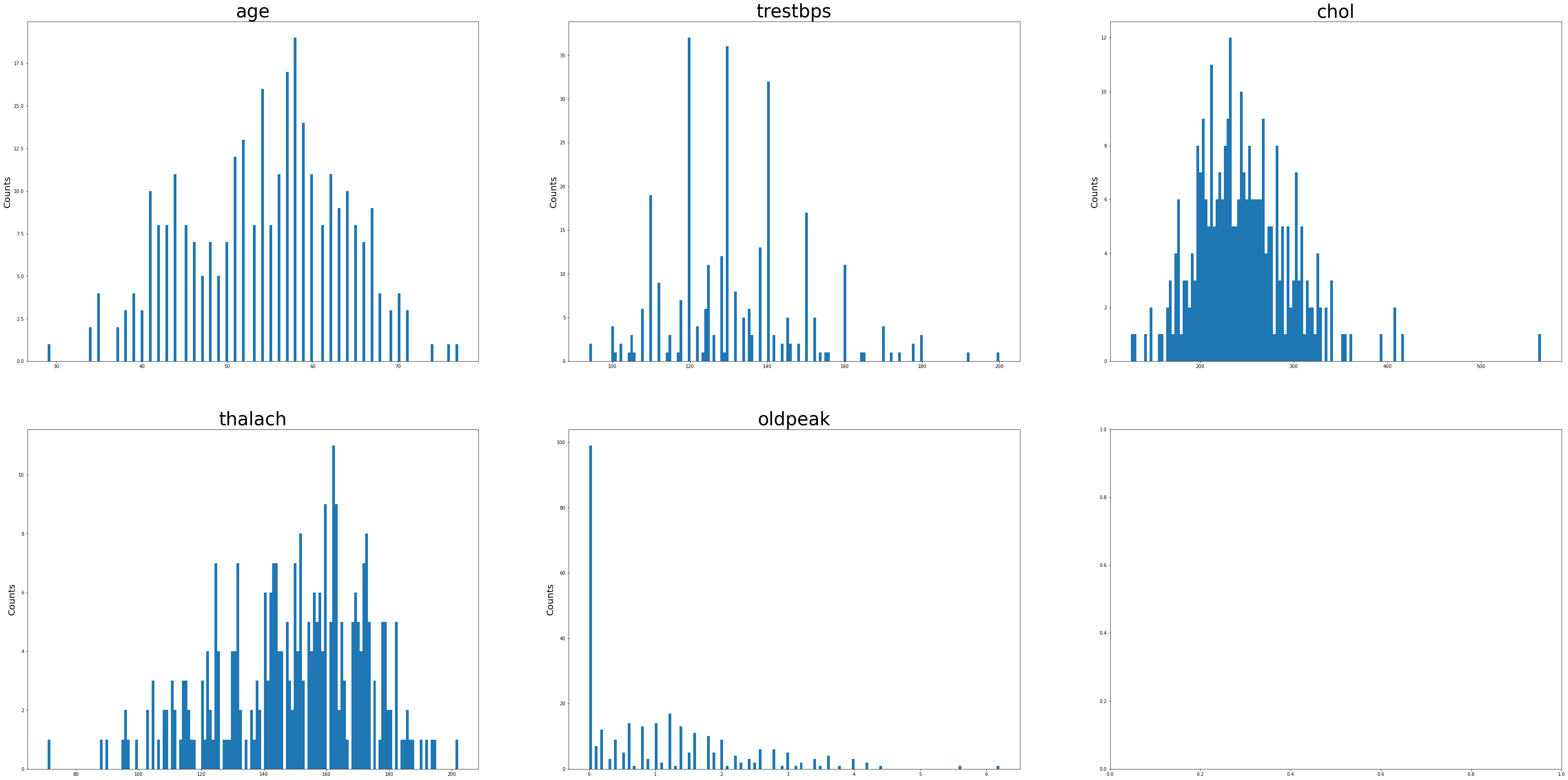
Age and max HR achieved during exercise (thalach) appeared to be negatively skewed. Resting Systolic BP, Cholesterol, ST depression during exercise were more positively skewed.
#Plotting Categorical Variables To Analyze Distributions

#Importing Seaborn
import seaborn as sns

#Creating Dataframe for Only Categorical Variables
df2 = df.drop(['age', 'trestbps', 'chol', 'thalach', 'oldpeak', 'ca'], axis = 1)

sns.countplot(x = df2.sex, data = df2)
plt.title('Gender Distribution')
plt.xticks([0,1], ['Female', 'Male'])
plt.xlabel(xlabel = None)
plt.ylabel('Counts')
plt.show()

sns.countplot(x = df2.cp, data = df2)
plt.xticks([0, 1, 2, 3], ['Typical Angina', 'Atypical Angina', 'Non-Anginal Pain', 'Asymptomatic'])
plt.xlabel(xlabel = None)
plt.ylabel('Counts')
plt.title('Type of Chest Pain')
plt.show()

sns.countplot(x = df2.fbs, data = df2)
plt.xticks([0,1], ['FBS <120', 'FBS >120'])
plt.xlabel(xlabel= None)
plt.ylabel('Counts')
plt.title('Fasting Blood Sugar Distribution')
plt.show()

sns.countplot(x = df2.restecg, data = df2)
plt.xticks([0,1,2], ['Normal', 'ST-T wave Abnormalities', 'Probable LVH'])
plt.xlabel(xlabel = None)
plt.ylabel('Counts')
plt.title('Resting ECG Findings')
plt.show()

sns.countplot(x = df2.exang, data = df2)
plt.xticks([0,1], ['No Symptoms', 'Angina During Stress Test'])
plt.xlabel(xlabel = None)
plt.ylabel('Counts')
plt.title('Symptoms During Stress Test')
plt.show()

sns.countplot(x = df2.slope, data = df2)
plt.xticks([0,1,2], ['Upsloping ST Segment', 'Flat ST Segment', 'Downsloping ST Segment'])
plt.xlabel(xlabel = None)
plt.ylabel('Counts')
plt.title('EKG Findings During Stress Test')
plt.show()
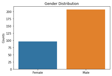
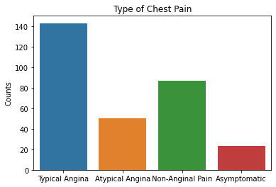
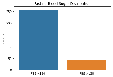
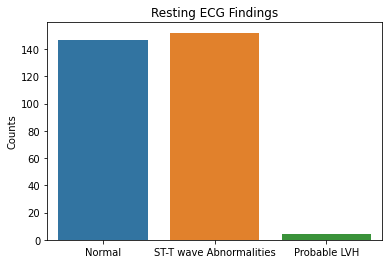
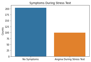
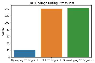
Based on the results above, the majority of patient’s tested were males, had typical angina, had fasting blood sugars <120, with either normal/ST-T changes noted on their EKG, and had no symptoms during the stress test. Further EKG findings during the stress test showed either flat or downsloping ST segments. Note that downsloping ST segments is an unfavorable finding with a cardiac stress test.
These are important factors to note in that males as well as those with typical angina are more likely to have coronary artery disease based on pre-test probabilities so this raises questions that the patient population used in this dataset could have already had a higher likelihood of having CAD.
Examining Specialized Visualizations Including Probability Mass Functions, Cumulative Distribution Plots, And Probability Plots
#Subsetting Variables for CAD Presence and Absence To Visualize on PMF

cadpres = df[['target','chol']]
cadpresent = cadpres[cadpres.target == 1]
cadnegative = cadpres[cadpres.target != 1]

bpcad = df[['trestbps', 'target']]
cadpresent2 = bpcad[bpcad.target == 1]
cadnegative2 = bpcad[bpcad.target != 1]

agecad = df[['age', 'target']]
cadpresent3 = agecad[agecad.target == 1]
cadnegative3 = agecad[agecad.target != 1]
#Generating PMF For CAD Presence and Absence with Cholesterol

width = 0.015

first_pmf = thinkstats2.Pmf(cadpresent['chol'])
other_pmf = thinkstats2.Pmf(cadnegative['chol'])

thinkplot.PrePlot(2)
thinkplot.Pmf(first_pmf, align = 'right', width = width, label = 'CAD Positive', color = 'blue')
thinkplot.Pmf(other_pmf, align = 'left', width = width, label = 'CAD Negative', color = 'orange')
thinkplot.Config(xlabel = 'Total Cholesterol (mg/dl)',
                ylabel = 'Probability')
thinkplot.Show(title = 'PMF Of Cholesterol Values Separated By CAD Presence and Absence'
               , xlabel = "Total Cholesterol (mg/dl)",)
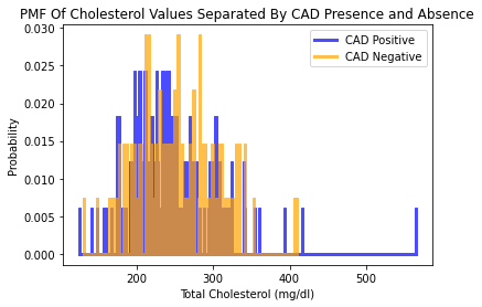
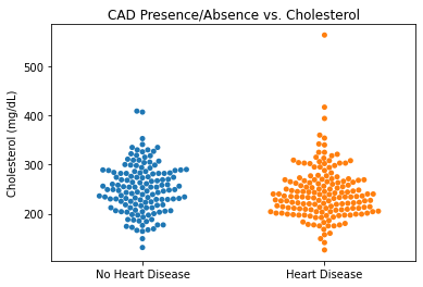
Interestingly, when visualizing the distribution of cholesterol values and whether or not CAD was present or absent, there appears to be an association that there were higher cholesterol values with no CAD. This is counterintuitive as higher cholesterol levels are generally associated with development of coronary artery disease.
#Generating PMF for Blood Pressure Values and CAD Presence/Absence
width = 0.015

first_pmf = thinkstats2.Pmf(cadpresent2['trestbps'])
other_pmf = thinkstats2.Pmf(cadnegative2['trestbps'])

thinkplot.PrePlot(2)
thinkplot.Pmf(first_pmf, align = 'right', width = width, label = 'CAD Positive', color = 'blue')
thinkplot.Pmf(other_pmf, align = 'left', width = width, label = 'CAD Negative', color = 'orange')
thinkplot.Config(xlabel = 'Systolic Blood Pressure (mmHg)',
                ylabel = 'Probability')
thinkplot.Show(title = 'PMF Of Blood Pressure Values Separated By CAD Presence and Absence'
               , xlabel = "Systolic Blood Pressure (mmHg)",)
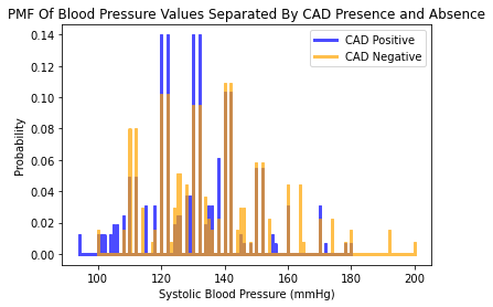
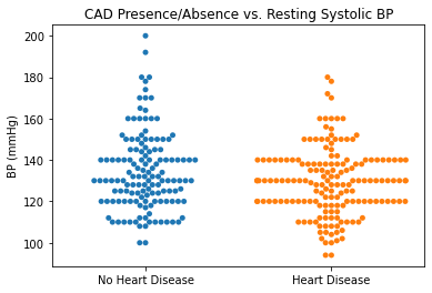
The distribution for the systolic blood pressure values appear to be more or less the same between those diagnosed without CAD and those diagnosed without CAD. There seems to be a significant proportion of individuals diagnosed with CAD at normal BPs (systolic BPs between 120 and 140).
#Generating PMF For Age and CAD Presence/Absence
width = 0.015

first_pmf = thinkstats2.Pmf(cadpresent3['age'])
other_pmf = thinkstats2.Pmf(cadnegative3['age'])

thinkplot.PrePlot(2)
thinkplot.Pmf(first_pmf, align = 'right', width = width, label = 'CAD Positive', color = 'blue')
thinkplot.Pmf(other_pmf, align = 'left', width = width, label = 'CAD Negative', color = 'orange')
thinkplot.Config(xlabel = 'Age (Years)',
                ylabel = 'Probability')
thinkplot.Show(title = 'PMF Of Age Separated By CAD Presence and Absence'
               , xlabel = "Age (Years)",)
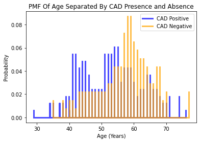
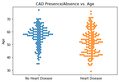
Considering the variable for age, it appears that the older individuals in the dataset were more likely to NOT be diagnosed with CAD. This is counterintuitive as the probability of developing CAD rises with aging.
#Plotting CDF for Age Breakdown
cdf1 = thinkstats2.Cdf(df.age)
thinkplot.Cdf(cdf1)
thinkplot.Show(title = 'CDF of Age', xlabel = "Age (years)", ylabel = "CDF")

#Plotting CDF for BP
cdf2 = thinkstats2.Cdf(df.trestbps)
thinkplot.Cdf(cdf2)
thinkplot.Show(title = 'CDF of Systolic Blood Pressure', xlabel = "Resting Systolic Blood Pressure (mmHg)", ylabel = "CDF")

#Plotting CDF for Cholesterol
cdf3 = thinkstats2.Cdf(df.chol)
thinkplot.Cdf(cdf3)
thinkplot.Show(title = 'CDF for Cholesterol', xlabel = "Cholesterol (mg/dL)", ylabel = "CDF")
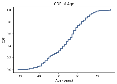
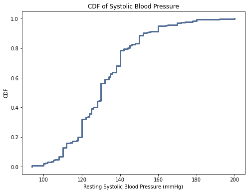
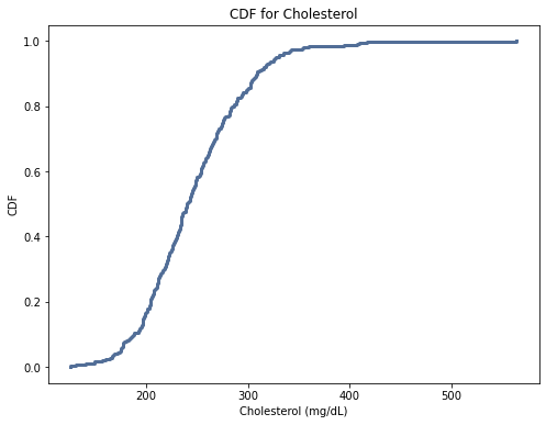
For age, the CDF is close to normal distribution. For the cholesterol variable, the curve is steeper indicating a higher frequency of those values. This suggests there were a larger proportion of elevated cholesterols as compared to lower cholesterols. The systolic blood pressure variable is similar to the cholesterol variable.
This could impact the analysis as it seems that the dataset has higher baseline cholesterol values so there would already be an increased likelihood of having CAD given those levels
#Plotting lognormal distribution for age variable
def MakeNormalPlot(age):
    mean = age.mean()
    std = age.std()

    xs = [-4, 4]
    fxs, fys = thinkstats2.FitLine(xs, inter=mean, slope=std)
    thinkplot.Plot(fxs, fys, color = 'blue', label = 'Model')

    xs, ys = thinkstats2.NormalProbability(age)
    thinkplot.Plot(xs, ys, label = 'Age')
    thinkplot.Show(title = 'Normal Probability Plot for Age Variable', xlabel = 'Standard Normal Sample', ylabel = 'Sample Values')

MakeNormalPlot(age)

#Plotting lognormal distribution for BP variable
def MakeNormalPlot1(resting_bp):
    mean = age.mean()
    std = age.std()

    xs = [-4, 4]
    fxs, fys = thinkstats2.FitLine(xs, inter=mean, slope=std)
    thinkplot.Plot(fxs, fys, color = 'blue', label = 'Model')

    xs, ys = thinkstats2.NormalProbability(age)
    thinkplot.Plot(xs, ys, label = 'Resting Systolic BP')
    thinkplot.Show(title = 'Normal Probability Plot for Age Variable', xlabel = 'Standard Normal Sample', ylabel = 'Sample Values')

MakeNormalPlot1(resting_bp)

#Plotting lognormal distribution for Chol variable
def MakeNormalPlot2(chol):
    mean = age.mean()
    std = age.std()

    xs = [-4, 4]
    fxs, fys = thinkstats2.FitLine(xs, inter=mean, slope=std)
    thinkplot.Plot(fxs, fys, color = 'blue', label = 'Model')

    xs, ys = thinkstats2.NormalProbability(age)
    thinkplot.Plot(xs, ys, label = 'Cholesterol')
    thinkplot.Show(title = 'Normal Probability Plot for Age Variable', xlabel = 'Standard Normal Sample', ylabel = 'Sample Values')

MakeNormalPlot2(chol)
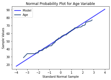
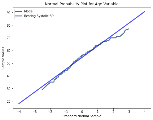
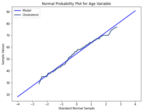
The three variables tested here using probability plots all appear to follow a mostly normal distribution indicated by their minimal deviations from a straight line. At the extreme values however, there are more significant deviations. Thus for middle range values, the extreme values in the tails of all three of the different variables may cause instability in our modeling algorithms.
Generating Scatterplots Between Variables and Assessing For High Levels of Correlation
#Getting Correlation Matrix Based on Our Variables

#Generating Correlation Matrix
corr_matrix = df.corr()
corr_matrix
| age | trestbps | chol | thalach | oldpeak | ca | |
|---|---|---|---|---|---|---|
| age | 1.000000 | 0.279351 | 0.213678 | -0.398522 | 0.210013 | 0.276326 |
| trestbps | 0.279351 | 1.000000 | 0.123174 | -0.046698 | 0.193216 | 0.101389 |
| chol | 0.213678 | 0.123174 | 1.000000 | -0.009940 | 0.053952 | 0.070511 |
| thalach | -0.398522 | -0.046698 | -0.009940 | 1.000000 | -0.344187 | -0.213177 |
| oldpeak | 0.210013 | 0.193216 | 0.053952 | -0.344187 | 1.000000 | 0.222682 |
| ca | 0.276326 | 0.101389 | 0.070511 | -0.213177 | 0.222682 | 1.000000 |
#Selecting Upper Triangle of Correlation Matrix
upper = corr_matrix.where(np.triu(np.ones(corr_matrix.shape), k=1).astype(np.bool))

#Finding Index of Highly Correlated Variables (Correlation >0.95)
to_drop = [column for column in upper.columns if any (upper[column] > 0.95)]
There are no highly correlated variables with absolute value of correlation > 0.95.
#Generating Swarm Plots for Our Predictors vs. our Target Variable

#Setting Category Variable
categories = df.target

#Plotting Age vs. CAD
sns.swarmplot(categories, df.age)
plt.title('CAD Presence/Absence vs. Age')
plt.xlabel(xlabel = None)
plt.ylabel('Age')
plt.xticks([0,1], ['No Heart Disease', 'Heart Disease'])
plt.show()

#Plotting Cholesterol vs CAD
sns.swarmplot(categories, df.chol)
plt.title('CAD Presence/Absence vs. Cholesterol')
plt.ylabel('Cholesterol (mg/dL)')
plt.xlabel(xlabel = None)
plt.xticks([0,1], ['No Heart Disease', 'Heart Disease'])
plt.show()

#Plotting Resting BP vs. CAD
sns.swarmplot(categories, df.trestbps)
plt.title('CAD Presence/Absence vs. Resting Systolic BP')
plt.ylabel('BP (mmHg)')
plt.xlabel(xlabel = None)
plt.xticks([0,1], ['No Heart Disease', 'Heart Disease'])
plt.show()

#Plotting Max HR Achieved vs. CAD
sns.swarmplot(categories, df.thalach)
plt.title('CAD Presence/Absence vs. Max HR Achieved During Stress Test')
plt.ylabel('HR (bpm)')
plt.xlabel(xlabel = None)
plt.xticks([0,1], ['No Heart Disease', 'Heart Disease'])
plt.show()
#Generating Scatter Plot Between Age and Cholesterol
plt.scatter(age, chol)
plt.title('Scatterplot of Age vs. Cholesterol Values')
plt.xlabel('Age (years)')
plt.ylabel('Cholesterol (mg/dL)')
plt.show()

#Generating Scatterplot Between Age and BP
plt.scatter(age, resting_bp)
plt.title('Scatterplot of Age vs. Resting Systolic BP')
plt.xlabel('Age (years)')
plt.ylabel('Systolic Blood Pressure (mmHg)')
plt.show()

#Generating Scatterplot Between Cholesterol and BP
plt.scatter(chol, resting_bp)
plt.title('Scatterplot of Cholesterol vs. Resting Systolic BP')
plt.xlabel('Cholesterol (mg/dL)')
plt.ylabel('Systolic Blood Pressure (mmHg)')
plt.show()
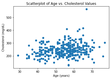
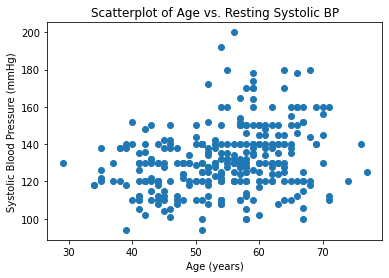
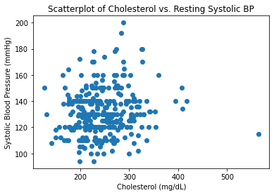
As expected, these variables are positively correlated with one another and verify common associations that as you age, your BP and cholesterol values tend to increase. Likewise, there is seems to be an association between increased cholesterol values and increased blood pressure.
Using Logistic Regression Model To Predict Heart Disease
The next step was to determine if a logistic regression model could be used to predict heart disease presence or absence based on the variables in this dataset.
#Importing Packages
from sklearn.model_selection import train_test_split
from sklearn.linear_model import LogisticRegression
from sklearn.preprocessing import StandardScaler
from sklearn.metrics import classification_report, confusion_matrix

#Creating Features and Target Object
features = df.drop('target', axis = 1)
target = df.target

#Getting Dummy Variables for Categoricals
features_new = pd.get_dummies(features)

#Creating Standardizer
standardizer = StandardScaler()

#Creating Logistic Regression Object
logit = LogisticRegression()

#Standardizing Features
features_standardized = standardizer.fit_transform(features_new)

#Train Test 80/20 Split
features_train, features_test, target_train, target_test = train_test_split(features_standardized, target, test_size = 0.2)

#Fitting Data to Logit
logreg = logit.fit(features_train, target_train)

#Generating Confusion Matrix and Classification Report
target_pred = logit.predict(features_test)
test0 = np.array(target_test)
predictions0 = np.array(target_pred)
print("Confusion Matrix:\n", confusion_matrix(test0, predictions0), '\n')
print("Classification Report:\n", classification_report(test0, predictions0))
Confusion Matrix:
 [[25  3]
 [ 7 26]]

Classification Report:
               precision    recall  f1-score   support

           0       0.78      0.89      0.83        28
           1       0.90      0.79      0.84        33

    accuracy                           0.84        61
   macro avg       0.84      0.84      0.84        61
weighted avg       0.84      0.84      0.84        61
This model performed reasonably well. There were some misclassifications. There were 7 classified as having heart disease when they did not have heart disease. Further, there were 3 classified as not having heart disease when they indeed did have heart disease. The F1 score was slightly higher for predicting heart disease as opposed to not. However, the score was not above 90%.
#Checking Feature Importance Based on Coefficients

#Importing Packages
from yellowbrick.model_selection import FeatureImportances

#Getting Labels and Checking Feature Importance
labels = list(map(lambda x: x.title(), features_new))
viz = FeatureImportances(logreg, labels = labels)
viz.fit(features_train, features_test)
viz.show()
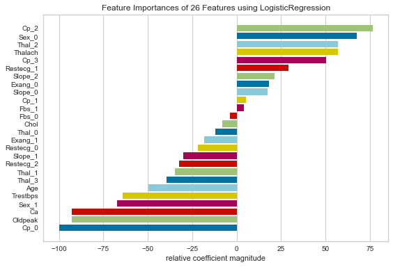
Based on coefficients, some of the most important features in this logistic regression model were pain that was non-anginal, being asymptomatic, female sex, max HR obtained during stress test, downsloping ST segments, and anginal pain.
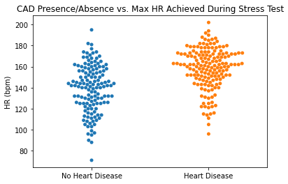
Considering factors traditionally associated with having a higher probability of heart disease, anginal pain, downsloping ST segments, and max HR obtained during stress test are predictive of CAD. Those with angina (typical CAD related pain) and those with lower Max HR during stress tests are more likely to have CAD. Interestingly enough, female sex was also considered very important as was non-anginal pain. This is counter intuitive. This could simply be a result of the specific population that was tested.
To see more complete coding and analysis, please refer to my GitHub repository.